Photo: Brendan Smialowski/AFP via Getty Images
If I had to pick a word to describe Calibri, the sans-serif typeface that was the default font for Microsoft apps from 2007 to 2024, it would probably be “inoffensive.”
Sure, Microsoft’s “extremely readable” font has had its critics over the years, but they’ve mostly just complained that it’s too plain, that it lacks personality. I’d bet that for most people, Calibri became a ubiquitous, thoughtless part of their normal life, from office memos to book reports, and few probably realized it was designed and implemented to be a more readable typeface on digital screens — which it has been. Even Microsoft has said that customers didn’t really have strong feelings about it, unlike with other fonts. Everybody thought it was … fine. But it turns out we were all wrong: According to the Trump administration, this 21-year-old boring font is weak and woke.
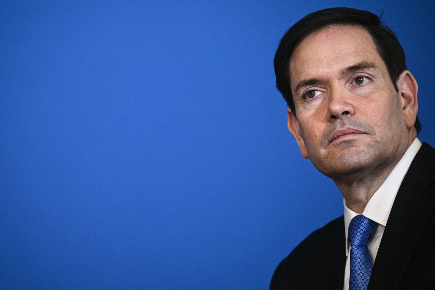
Secretary of State Marco Rubio on Tuesday barred the use of Calibri at the State Department and brought back the serif Times New Roman, which was the agency’s official font from 2004 to 2023. This was necessary, he said, to reverse the “wasteful” and distasteful shift to Calibri ordered by his Biden administration predecessor, Antony Blinken. Rubio alleged that change — which provoked little meaningful controversy at the time — was yet another example of woke radicalism run amok, since the change was recommended by the State Department’s now-disbanded DEI office because Calibri is considered to be easier to read for people with disabilities like dyslexia or vision problems. Per the New York Times report:
While mostly framed as a matter of clarity and formality in presentation, Mr. Rubio’s directive to all diplomatic posts around the world blamed “radical” diversity, equity, inclusion and accessibility programs for what he said was a misguided and ineffective switch from the serif typeface Times New Roman to sans serif Calibri in official department paperwork.
In an “Action Request” memo obtained by The New York Times, Mr. Rubio said that switching back to the use of Times New Roman would “restore decorum and professionalism to the department’s written work.” Calibri is “informal” when compared to serif typefaces like Times New Roman, the order said, and “clashes” with the department’s official letterhead. …
Mr. Rubio’s directive, under the subject line “Return to Tradition: Times New Roman 14-Point Font Required for All Department Paper,” served as the latest attempt by the Trump administration to stamp out remnants of diversity initiatives across the federal government. …
Echoing President Trump’s call for classical style in federal architecture, Mr. Rubio’s order cited the origins of serif typefaces in Roman antiquity.
Julius Caesar would never have used Calibri, so neither should Donald Trump’s federal government, where addressing the needs of the disabled is nowhere near as important as demonizing diversity and fetishizing trad aesthetics.
Related
U.S. Department of State Cuts Diplomatic Ties With Serifs10 Stupid Moments From Trump’s Pennsylvania Rally<null>
From Intelligencer - Daily News, Politics, Business, and Tech via this RSS feed

